The Brief
A Logo and Very Little Else
The client came to Brience with a logo and very little else. The brand mark mattered to them more than anything else in the project, and they wanted it built as a lit interior sign that would read as the logo rather than an approximation of it.
What they could hand over was a single PNG. There was no vector artwork, no colour code, no material specification and no shop drawing. Everything a fabricator normally starts from had to be produced first.
The Challenge
No Artwork, a Screen Colour, and a Wide Lit Face
No production artwork: a flat PNG cannot drive a router or a laser. The logo had to be rebuilt as clean vector geometry, accurate enough that the client would recognise it as their own mark and not a redraw.
Screen colour against painted colour: the supplied blue was a bright RGB value of the kind that lives happily on a screen and sits outside what paint can reproduce. Matching it by eye on a monitor would have guaranteed a miss.
Even light across a rigid flat face: a sign this wide has to stay flat and resist twisting while diffusing the LED array evenly, with no bright spots over the emitters and no dark corners. The piece also had to survive handling, transport and hanging without the face or the painted edges marking.
Our Approach
Engineered as One Stiff Assembly
Laminated MDF body, 1 1/2 inches thick: two 3/4 inch layers bonded into one panel. MDF machines to a crisp profile on tight interior curves and takes paint to a dead flat finish, and the laminated pair gives the stiffness the span needs without the cost and weight of a metal frame.
White ACM backer, 1/8 inch: the LEDs mount to an aluminium composite backer rather than to the MDF. It is dimensionally stable, will not sag or absorb moisture, and the white face lifts output by reflecting light forward into the diffuser.
White translucent sign acrylic faces, 1/8 inch: chosen for even diffusion at a shallow depth, and because it reads as a solid clean white when the sign is switched off — which is how the piece spends much of its life. The keyline around each letter is a separate 1/16 inch black acrylic cut layer rather than painted detail: it holds a sharp edge, will not bleed or chip, and gives the face a physical step that catches light.
Dimmable 24 volt LED at 4000K, specified so the sign can be tuned to the room it sits in rather than running at one fixed output. The acrylic faces sit recessed into the routed body so the black outline reads as a true edge around each letter, and the LED spacing behind each face was set against the diffuser depth so the light lands evenly across the widest letters.
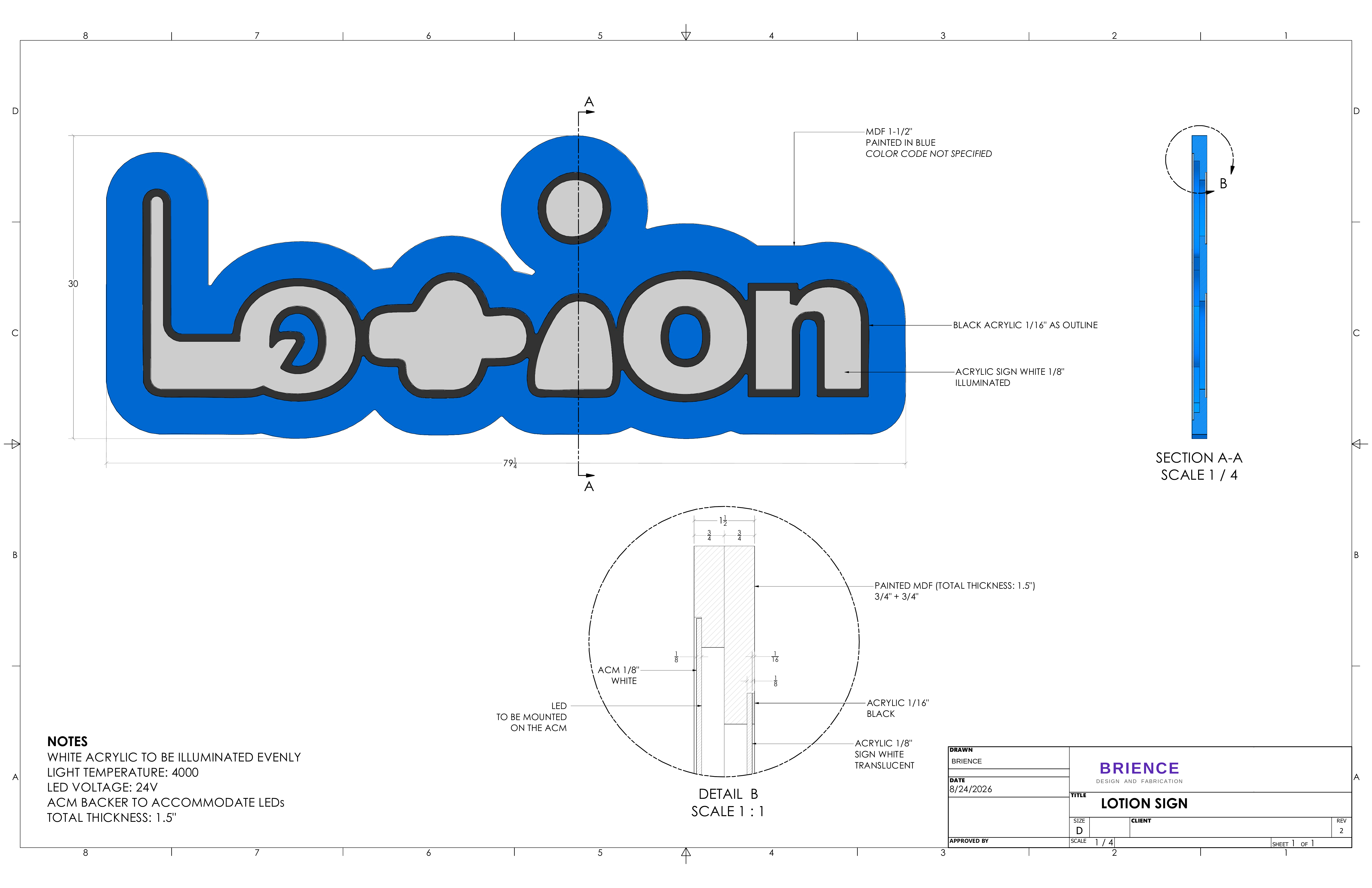
Shop drawing REV 2, with the section and layer detail used on the floor.
Proving It Before Production
Settled Physically, Not on Screen
Colour was resolved by putting real painted samples against the artwork under shop lighting and working down to the closest standard match, so the blue was confirmed in the room it would be judged in.
Illumination was proven by wiring and lighting the complete sign on the bench and running it through its full dimming range before anything was packed — which is where hot spots, uneven diffusion and flicker show up while they are still cheap to fix.
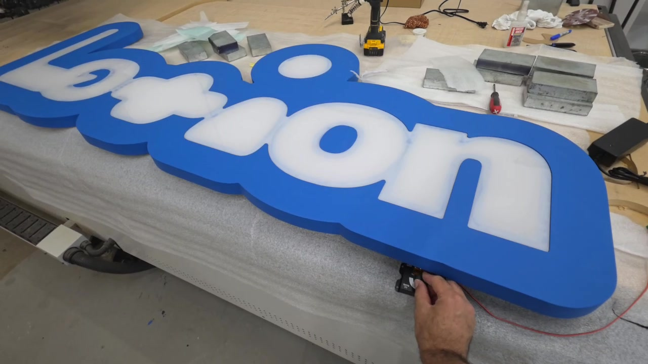
Bench test at low output.
The Result
One Even Sheet of Light
Lit, the sign does the thing the client cared about most. The white faces come up as one even sheet of light with no visible emitters behind them, the black keyline holds its edge hard against the glow, and the painted blue body stays matte and quiet so the lit letters carry the piece.
Taken down to the bottom of its range the sign holds colour and stays smooth rather than stepping or flickering. Switched off it still reads correctly, white on blue, which is how a sign in a working interior is seen most of the time.
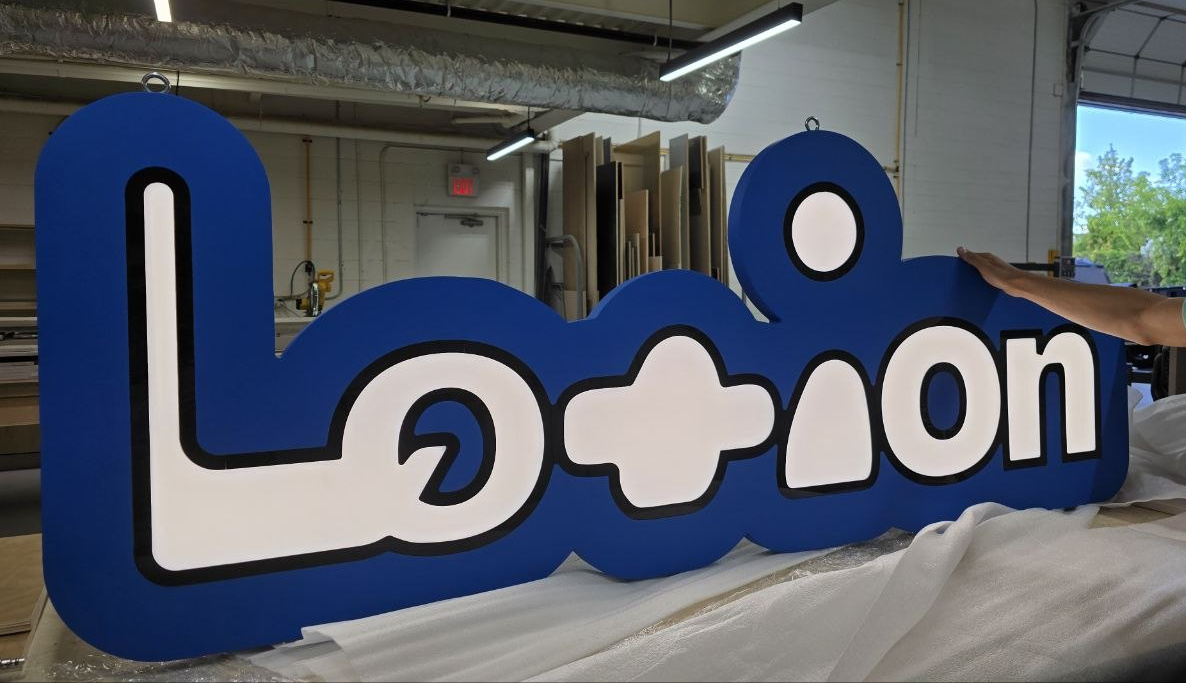
The completed sign at the Brience shop, checked and wrapped before handover.
Technical Specifications
What We Built
What We Delivered
End-to-End, Under One Roof
Artwork
Rebuilt the logo from a single PNG into clean production vector geometry accurate to the original mark.
Colour Matching
Resolved the screen-blue to a physical paint match using real painted samples under shop lighting.
Fabrication
Built the sign in-house: laminated MDF body, routed recesses, acrylic faces and keyline, LED integration.
Testing
Wired and lit the complete sign on the bench through its full dimming range before handover.